However, many Shopify stores still rely on basic dropdown menus that list color names without showing what those colors actually look like. Although dropdowns are functional, they may not provide the most convenient shopping experience.
Fortunately, visual color swatches, product variant images, and thoughtfully designed selectors can make product options easier to understand.
In this guide, we’ll explore how to display multiple product colors effectively, avoid common variant selection mistakes, and create product pages that help shoppers make more confident purchasing decisions.
Why Displaying Multiple Product Colors Matters for Shopify Stores
When customers shop online, they cannot physically examine products before buying them. Therefore, product photography and visual presentation play an important role in communicating product details.
For example, imagine a customer shopping for a handbag available in black, beige, burgundy, and navy blue.
If the store displays only a dropdown menu, the shopper must select each color individually to understand the available options. However, when those colors appear as visual swatches, customers can immediately recognize the choices.
As a result, the shopping experience becomes more intuitive.
Benefits of Displaying Product Colors Visually
- Make available product colors easier to discover.
- Reduce unnecessary navigation between product options.
- Help customers compare different shades.
- Improve the visual organization of product pages.
- Create a more consistent shopping experience.
- Support clearer product selection on mobile devices.
Furthermore, visual color selection can help shoppers recognize product variations that they might otherwise overlook.
Understanding Shopify Color Variants
Shopify color variants allow merchants to offer multiple versions of a product within a single product listing.
For instance, a clothing retailer might sell one sweater in five colors and four sizes. Instead of creating a separate product for every combination, the merchant can configure product options and their corresponding variants.
Each variant may have its own inventory information, SKU, price, and associated image.
Consequently, customers can select the exact version they want without navigating through multiple unrelated product listings.
Example of a Shopify Product With Multiple Colors
Consider a handbag offered in the following variations:
- Classic Black
- Chocolate Brown
- Soft Beige
- Deep Burgundy
- Navy Blue
Although all five variations belong to the same product, each color may have different inventory availability.
Therefore, the storefront should clearly communicate both the selected color and its availability.
Method 1: Display Product Colors Using Shopify’s Built-In Variant Options
Shopify provides product variant functionality that allows merchants to create options such as color, size, and material.
However, the way these options appear on the storefront depends on the Shopify theme and its available settings.
How to Create Product Color Options
- Open your Shopify admin dashboard.
- Navigate to Products.
- Select the product you want to update.
- Locate the product options or variants section.
- Add or edit an option named Color.
- Enter the available colors.
- Assign appropriate images and inventory information to the variants.
- Save your changes.
After saving, preview the product page to confirm how your theme displays the available options.
Some themes support visual swatches through their built-in settings. Meanwhile, others may display a traditional dropdown or button selector.
For more information, consult the official Shopify product variants guide.
Method 2: Replace Dropdown Menus With Shopify Color Swatches
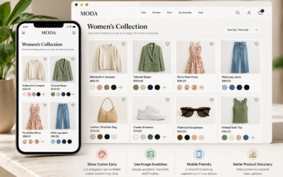
One of the most visually appealing ways to display product colors is through Shopify color swatches.
Color swatches represent each available color using a small visual indicator, such as a circle or square.
For example, instead of showing a dropdown labeled Color, a product page might display five colored circles representing the available handbag variations.
When customers select a swatch, the product page should update its selected variant information accordingly.
Why Color Swatches Are Useful
First, swatches make available colors immediately visible. Additionally, they allow customers to compare choices without repeatedly opening dropdown menus.
Furthermore, color swatches can complement a store’s visual branding when their size, shape, and spacing remain consistent.
Nevertheless, merchants should avoid relying exclusively on color to communicate selection.
For accessibility, include descriptive labels and a clear visual indicator showing which variation is currently selected.
Method 3: Use Shopify Variant Images for More Accurate Product Previews
Although simple color swatches work well for many products, some variations require more detailed visual representations.
For example, a patterned dress cannot always be represented accurately by a single colored circle.
Similarly, a leather handbag may have different textures, finishes, and hardware colors depending on the variation.
In these situations, Shopify variant images can help customers understand the differences.
How Image Swatches Improve Product Selection
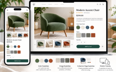
Image swatches use actual product photographs or thumbnails to represent available options.
Instead of displaying a brown circle, a store might show a miniature photograph of the brown handbag.
Consequently, shoppers can compare product appearances more directly.
Products That Benefit From Image Swatches
- Handbags with different materials and finishes
- Clothing available in multiple patterns
- Shoes with different color combinations
- Furniture with various upholstery options
- Wallpaper and decorative home products
- Cosmetics with multiple shades
- Accessories with distinctive designs
Additionally, merchants should use consistent product photography to avoid misleading comparisons.
Method 4: Improve Product Color Selection With a Shopify Swatch App
Some Shopify merchants want more control over the appearance of their product variant selectors than their existing themes provide.
In these situations, a dedicated Shopify color swatch app may be worth considering.
Depending on the application, merchants may be able to customize swatch appearance, use image-based selectors, and improve how available product options are presented.
However, compatibility and specific features vary between applications. Therefore, store owners should verify that a chosen app supports their Shopify theme and desired functionality.
Introducing Swatchify Pro
Swatchify Pro is a Shopify-focused product swatch solution for merchants interested in presenting product variations more visually.
For stores selling products in multiple colors or styles, visual swatch presentation can provide an alternative to basic text-based selectors.
Furthermore, a thoughtfully configured swatch interface can complement product photography and create a more polished storefront appearance.
Explore Swatchify Pro to review its available features and determine whether it fits your store’s product presentation needs.
How to Design Better Shopify Product Color Options
Displaying multiple product colors involves more than adding attractive buttons to a product page.
Instead, merchants should consider how customers discover, compare, and select their preferred variations.
1. Display Color Options Near the Product Information
Place color selectors where shoppers naturally expect to find them, typically near the product title, price, and purchase controls.
As a result, customers can identify available choices before adding the product to their carts.
2. Show the Selected Color Name
Even when using visual swatches, display the name of the selected variation.
For example, a label reading “Color: Burgundy” helps customers confirm their selection.
Additionally, descriptive labels improve usability for shoppers who may have difficulty distinguishing similar colors.
3. Update Product Images When Colors Change
Whenever possible, connect each variation to the appropriate product photography.
For instance, selecting a navy blue shirt should display photographs of the navy blue version rather than continuing to show the black shirt.
Consequently, customers can evaluate the actual appearance of their selected variation.
4. Clearly Identify Unavailable Colors
If a particular color is sold out, communicate that information before the customer attempts to purchase it.
Depending on your storefront design, unavailable options might appear disabled or include an out-of-stock label.
However, the selected state and unavailable state should remain visually distinct.
5. Optimize Swatches for Mobile Shopping
Mobile users interact with product pages through touch rather than a mouse.
Therefore, swatches should provide sufficiently large touch targets and adequate spacing between choices.
Furthermore, product selectors should remain easy to use on smaller screens without creating unnecessary horizontal scrolling.
6. Maintain Consistent Styling
Use the same basic swatch appearance across similar product categories.
For example, consistent border styles, selection indicators, and spacing help customers understand how to interact with product variations throughout the store.
Color Swatches vs. Image Swatches: Which Is Better?
Choosing between color and image swatches depends on the products being sold.
| Feature | Color Swatches | Image Swatches |
|---|---|---|
| Visual representation | Solid colors | Product images or patterns |
| Best for | Simple color variations | Detailed visual variations |
| Product photography required | Not always | Usually |
| Space requirements | Typically compact | May require more space |
| Example | Basic T-shirt colors | Patterned handbags |
For example, a store selling plain cotton shirts may benefit from simple color circles.
However, a furniture retailer offering multiple fabric textures may prefer image swatches that show the actual materials.
Ultimately, the best approach is the one that communicates product differences accurately and clearly.
How Better Shopify Product Page Design Can Support Sales
Effective Shopify product page design helps customers find information, compare options, and complete purchases with fewer unnecessary obstacles.
Although visual swatches do not guarantee increased conversions, they can help improve the usability of product pages.
Make Variations Easier to Discover
When customers can immediately see available colors, they may be more likely to explore variations they would otherwise overlook.
Reduce Selection Confusion
Clear labels, accurate product photographs, and visible selection indicators can help customers understand exactly which variation they are choosing.
Create a More Consistent Shopping Experience
When product pages use consistent selectors, shoppers can become familiar with the store’s interface.
Consequently, navigating additional products may feel more straightforward.
Support Customer Confidence
Accurate variation previews can help customers form realistic expectations before purchasing.
Nevertheless, product descriptions, sizing guides, shipping information, and return policies remain equally important.
Common Mistakes When Displaying Multiple Product Colors
Even attractive product swatches can create problems when configured incorrectly.
Fortunately, merchants can avoid many issues by checking the following areas.
- Incorrect color matching: Ensure every swatch represents the actual product color.
- Missing variant images: Provide accurate photography when visual differences matter.
- Unclear selected states: Customers should always know which option is active.
- Small mobile controls: Avoid swatches that are difficult to tap.
- Missing accessibility labels: Include readable names and appropriate keyboard support.
- Outdated inventory information: Keep product availability synchronized with actual inventory.
- Inconsistent styling: Maintain predictable selectors throughout the storefront.
- Theme compatibility problems: Test swatch functionality after theme or app updates.
Additionally, review the W3C Web Accessibility Initiative for guidance on accessible website interactions.
How to Test Your Shopify Color Selection Experience
After implementing product swatches, merchants should test the storefront from a customer’s perspective.
First, open several product pages on desktop and mobile devices. Next, select different colors and confirm that the displayed images, prices, and availability information update correctly.
Then, add selected variations to the cart and verify that the correct product options appear during checkout.
Important Testing Questions
- Are all available colors visible?
- Does each swatch represent the correct variation?
- Do product images update appropriately?
- Can customers identify the selected color?
- Are unavailable variations clearly labeled?
- Do selectors work correctly on mobile devices?
- Can keyboard users access the available options?
- Does the correct variant appear in the shopping cart?
Furthermore, monitor product page analytics after making changes.
For example, changes in add-to-cart rates, conversion rates, and customer questions may help reveal whether the new interface improves the shopping experience.
Frequently Asked Questions About Shopify Product Colors
How do I display multiple product colors on Shopify?
Create a Color option for your product and add the available variations in Shopify. Then, use your theme’s supported settings or a compatible swatch app to display those colors visually.
Can Shopify display colors instead of a dropdown menu?
Yes. Some Shopify themes support built-in color swatches, while other stores may require theme customization or a third-party application.
What is a Shopify color swatch?
A Shopify color swatch is a visual indicator representing a product color. Customers can select the swatch to choose a corresponding product variation.
Can I show product images instead of color circles?
Yes. Image swatches can represent variations using product photographs or thumbnails, depending on the capabilities of your theme or installed application.
Should I create separate products for every color?
Not necessarily. Shopify variants allow merchants to group multiple colors within a single product. However, separate product listings may be appropriate for certain merchandising or catalog organization strategies.
Do color swatches improve Shopify conversions?
Color swatches can make product selection easier and improve visual presentation. However, conversion improvements depend on multiple factors and should be evaluated through store analytics.
Are image swatches better than color swatches?
Image swatches are often more useful for products with complex patterns, textures, or visual differences. Meanwhile, simple color swatches may be sufficient for products available in solid colors.
Can I use a Shopify swatch app with my existing theme?
Compatibility depends on the application and your Shopify theme. Therefore, review the app’s documentation and test its functionality before relying on it for your storefront.
Final Thoughts: Make Product Color Selection Easier on Shopify
Understanding how to display multiple product colors on Shopify can help merchants create clearer, more visually engaging product pages.
Although traditional dropdown menus remain functional, color and image swatches can make variations easier to discover and compare.
Furthermore, accurate product images, accessible labels, and mobile-friendly controls contribute to a more convenient shopping experience.
For Shopify merchants looking to improve the presentation of product options, visual swatch solutions are worth exploring.
Ready to make your Shopify product variations more visual?
Visit Swatchify Pro to explore a Shopify-focused swatch solution and learn how visual product selectors can fit into your storefront.


0 Comments